
When the Covid 19 pandemic hit, I was working as a consultant developer on a project for an airline parts manufacturer. We had just gone live with phase 1 and were about to commence phase 2. Needless to say, the contract was put on hold and given the massive impact that the pandemic has add on the airline industry, who knows when this will start up again. So my employer put me on furlough!
I’ve been writing code an almost a daily basis since I was 16 and I know full well that I certainly did not want to become stale, so I was going to keep coding even though I am not getting paid for it. This has given me the oppurtunity to work on a project just for my own enjoyment and to pick a subject that I was interested it and to try some technology that was new to me. So I decided to write an app for looking at the worldwide statistics for Covid 19.
Johns Hopkins University have been gathering data worldwide and making it available as CSV files since January, right at the beginning of the pandemic. I therefore decided to write something which will read these CSV files and transform the data into tables and charts which are a little easier to look at and pick up trends from, than raw CSV data.
Technology
Most of my career has been about developing client side code and for the last few years, on SAP platforms, first as an employee of SAP and more laterly as a consultant on SAP technologies. The last couple of years I have been involved in developing server side code on SAPs HANA database and using CDS and oData which makes everything much simpler. However, I needed to do this project on the cheap, so a HANA server was out of the question.
I also needed somewhere to host this app. I have had my own domain for a long time now but my website was left in a state of ‘under construction’ for years and years with no time to do anything about it. I used Siteground for hosting, but they do not allow running Node apps, so this was of no use to me. I looked around and decided to switch to A2Hosting as they allow Node to run on a shared server. Hence it’s not too expensive and I can both run a Node app and a website on the same domain.
Another issue is that rather than using the nice CDS (core data services) that comes with SAP HANA, I just had access to a MySQL server on A2Hosting and my SQL was a bit rusty, so I had to spend quite a bit of time learning MySQL and all about connection pools and how to make my calls to the database as efficient as possible, so that it works at a reasonable speed. There is a lot of data to analize.
Having made the choice to switch to A2Hosting, trying to get to a running app was much more complex than I had originally hoped. Getting a Node app to work was not a problem. Getting a WordPress website to work was not a problem, but getting them both to work together was a different story, which I may post the details about later, but eventually things came together and the app is now up and running.
With all the backend things and devops things that needed to be done, for the UI, I decided to stick with SAP UI5.
The app
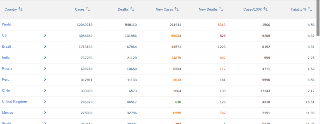
You can access the app at https://fletcherhome.net/covidanal/index.html and you will initally see a table of all the latest Covid-19 data sorted by the total number of cases. However you can sort by any column by clicking the column header.
For some of the countries you will see an arrow next to the name of the country. If you click on this arrow, it will take you different regions in that country, for example for the US, you will get to each state and from there you can get to each county.
In the table of data, some items may be seen in different colours. Red means that the number of new cases or deaths for the last day for which we have data, is at least 25% higher than the daily 7 day average for a week ago. This will highlight where the situation is particularly bad. A colour of orange is showing that the value is higher than it was a week ago, but not as much as 25% higher. Sometimes you may see a green number. That shows that there was a 50% drop since last week, so things are going in the right direction.
You can also click on any of the countries, states, counties that are listed. Then it will show you 4 charts of data for that country (state or county). The first chart will show a timeline of all the cases since there was a recording of a case and it will also show a rolling 7 day average which smooths out days (often at weekends) where the number of cases may be too variable. We also have a chart which shows the same data for deaths and also charts which show the cumulative total of cases and deaths.
Here is an example of the cases in California
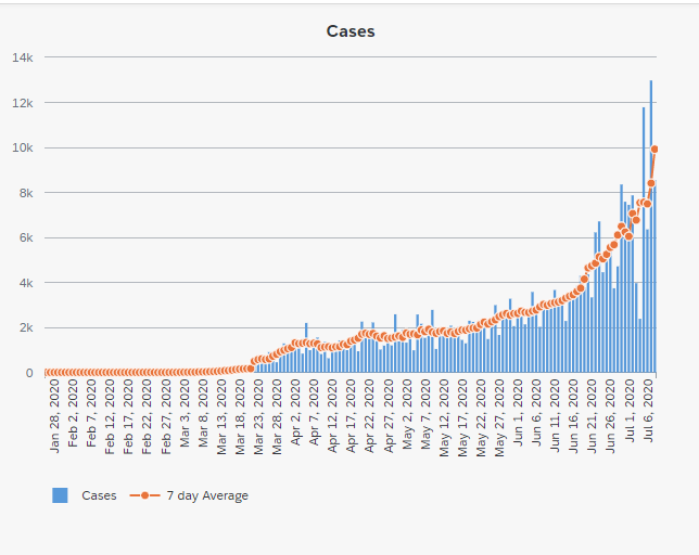
Remember though that these charts are only as good as the data that has been reported. As an example, it the United Kingdom, initially the only testing that was done was in hospital and only deaths were recorded if they happened in hospitals. At some point, they started testing outside of hospitals and started recording deaths outside of hospitals. On the date when these changes were made, you see a massive jump in cases or deaths, which distorts the whole chart. Of course not all these deaths happened on the same day, they were spread out over many weeks before that date, but the statistics were never corrected, so the data is what it is.
Please give the app a go and let me know what you think.